When you’ve built something that resonates online, the next step is often to make it tangible.
That’s what writer and illustrator Tim Urban, creator of Wait But Why, set out to do.
Before Scribe: A Digital Classic Without a Physical Home
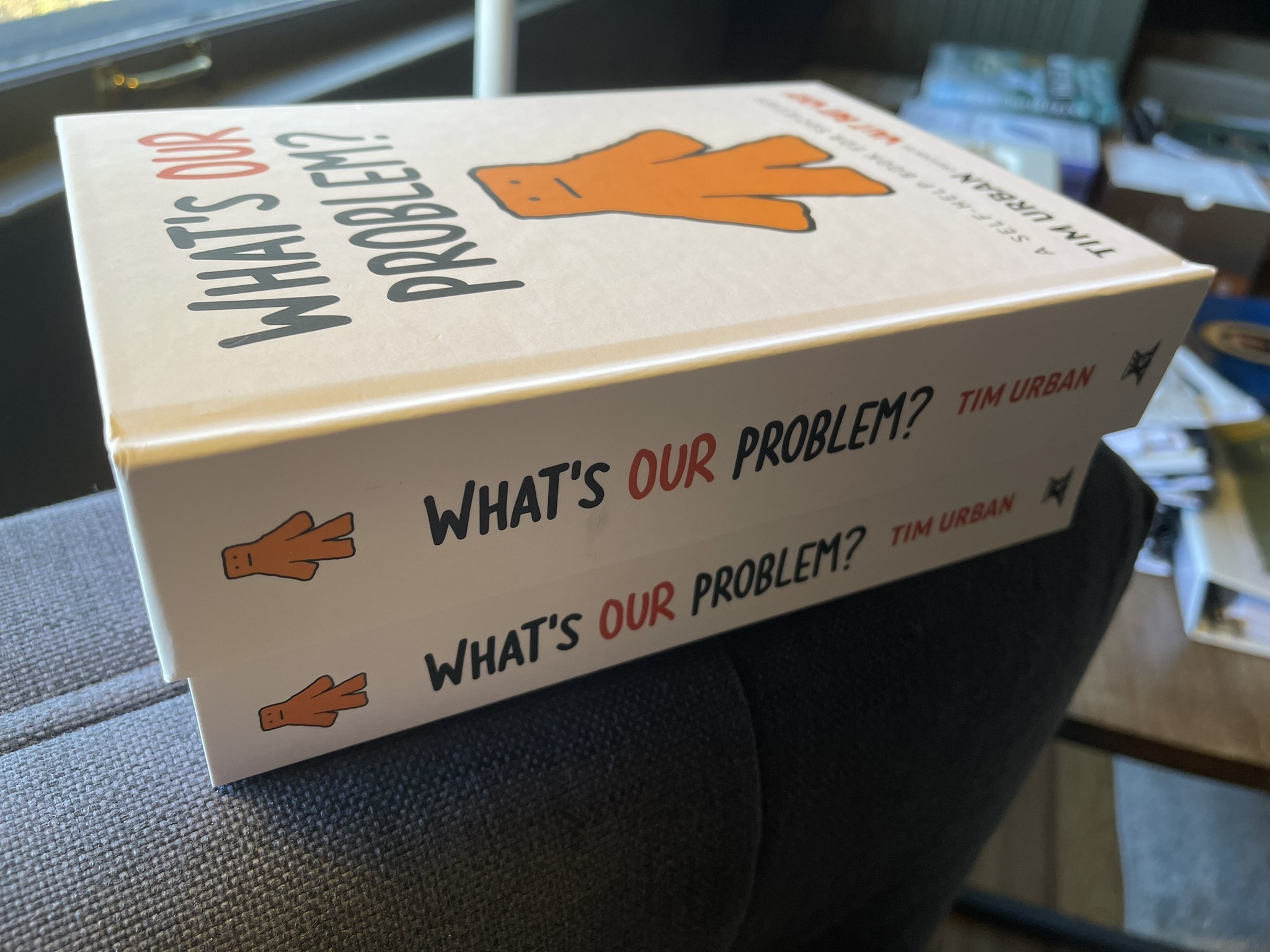
Tim had already written and illustrated a wildly successful ebook: a playful, deeply thoughtful exploration of the human condition, filled with his trademark humor and over 300 original graphics called “What’s Our Problem?”
The book had reached tens of thousands of readers. It was intelligent, funny, and visually distinct; the kind of work that goes viral, inspires long comment threads, and keeps readers reading.
Then one Christmas, Tim’s wife printed a single, physical copy as a surprise.
Something clicked.
Well, that and readers were clamoring for a way to read his longest-ever piece in a beautiful physical book.
The challenge? Translating a dense, illustration-heavy digital project into a print book that looked beautiful, felt professional, and stayed affordable.
Why Tim Urban Chose Scribe Media
Tim came to Scribe with three non-negotiables:
- Every illustration must be preserved exactly as intended
- The final product must be high-quality yet affordable for readers
- The process had to be transparent and fast
As a huge fan of Tim and Wait But Why, Eric Jorgenson absolutely insisted that we take on this project and do everything we could to overdeliver.
The Process: Engineering The Wait But Why Book, “What’s Our Problem”
The project was unlike anything Scribe had taken on before.
A typical nonfiction book might feature a handful of charts or images; Tim’s manuscript had hundreds. Each visual needed to interact with the text in a specific way—sometimes reinforcing a joke, other times serving as the core of an idea.

Scribe’s design and production teams built a custom workflow around four key stages:
- Organizing the assets
- Every file (illustration, caption, footnote, and text block) was cataloged and synchronized in a master system. This ensured nothing was lost or misaligned in translation.
- Designing for readability and rhythm
- The layout had to feel like a Tim Urban post: clear, witty, and effortless. Designers balanced white space, text density, and visual flow so that each page invited readers to move forward.
- Iterating until it was perfect
- Over 25 full versions were produced, reviewed, and refined (a Scribe record at the time). A detailed change log tracked every tweak: line breaks, image resolution, caption spacing, pagination, and margin alignment.
- Printing for permanence
- Once the layout was finalized, Scribe engineered a full-color print-on-demand solution that maintained fidelity while keeping costs down. The result: a premium product that could be shipped globally, one copy at a time.
After Scribe: A Digital Phenomenon Becomes a Physical Work of Art
When the first batch of books arrived, that hard work had paid off.Every line, color, and quirk of his digital vision had survived the transition; only now, it felt more alive.

Readers agreed. The print edition elevated what had once existed only as pixels.
Page turns carried rhythm.
The art popped.
Tim’s unique sense of humor landed.
And most importantly, the book was full-color, high-quality, and priced so that anyone who loved Tim’s work could own a copy.
What had begun as a small digital project had become a lasting piece of intellectual craftsmanship built to outlive the internet itself.
Scribe is unique because it combines the talent of top-tier publishers while keeping authors in control:
- Quality & Experience: Pros know how to handle hundreds of design dependencies without compromising quality.
- Creative Control: Tim’s words, drawings, and layout remained his — no royalties, no bearing on the book’s price, no hidden catches.
- One-Stop Partnership: From editorial refinement to print logistics, everything was managed under one roof.
Tim Urban’s first book proved that a complex project doesn’t have to mean a painful process.
If you’re planning something similar for your book, consider these lessons:
- Proof before you place. Lock text before layout begins
- Package your assets clearly. Organize and label illustrations and captions.
- Design with intention. Treat visuals as narrative, not decoration.
- Assign a single production owner. Someone must own the final decisions.
- Balance ambition with accessibility. The best books are both beautiful and attainable.

Curious what it would take to bring your project from laptop to bookshelf?
Explore how Scribe helps authors turn ambitious ideas into enduring books.
Ready to Write Your Book?
Scribe has helped 2,000+ authors turn their ideas into published books. Schedule a free consult to get started.
Schedule a Consult